December 16, 2009
Significant anomalies
In my last climate data posting I had managed to load the data into Matlab and plot some of it. Now I have extended the scripts to organize the data in time and space so that I can actually check whether there is a trend or not.
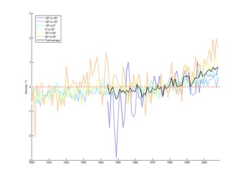
Here I have plotted the anomalies (the difference of each weather stations data from a mid-century reference period) averaged across different latitude bands of the world. There certainly seems to be a trend in all bands (and in the total average), but since stations come and go there could be bias. The shakiness of the early Antarctic curve also points at the problem of statistical significance: just how reliable are the aggregate measurements?
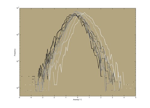
Looking instead of how the anomalies distribute themselves across time we get this. Here I have plotted the frequency of anomalies of different sizes from all stations in a given decade. The overall shape is nicely parabolic - they are roughly normally distributed. This is good for making statistical inference. Also note that the mean seem to be creeping upwards.
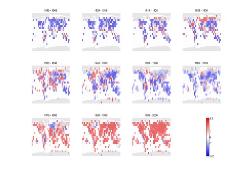
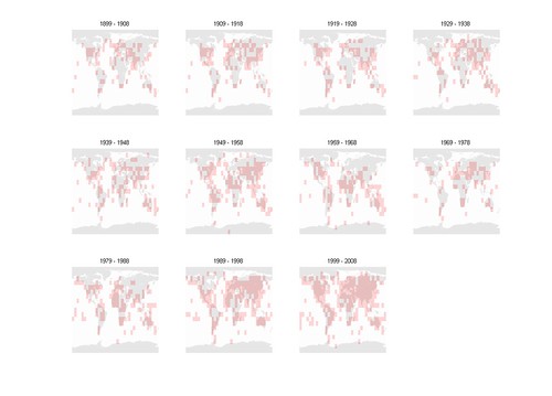
The next step was to write a script that gathered all data from stations inside a grid together, so I could run a real statistical significance test. I used a 10x10 degree grid, and compiled the yearly anomalies within each grid cell. I could then apply a Student's t-test to these to see if the mean anomaly was significantly different from zero.
Here are the t-values:
and here are the cells that are significant:
Finally, here are the mean anomalies:
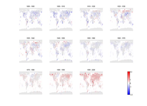
The result is pretty clear: this dataset is getting significantly warmer especially in the northern hemisphere over the last two decades.
Of course, this is very much a hobby experiment. I have used yearly anomalies rather than monthly, and this might mess up things. My Matlab code is messy and ugly, and I am not that great a statistician, so it is not at all unlikely there are bugs here. Still, it is nice to get to know a real dataset intimately and to figure out how to squeeze information from it.
Looking at there reference for the dataset this is a subsample of [P. Brohan, J.J. Kennedy, I. Harris, S.F.B. Tett and P.D. Jones, Uncertainty estimates in regional and global observed temperature changes: a new dataset from 1850. J. Geophys. Res, 111, D12106, doi:10.1029/2005JD006548 (pdf 1.2Mb)] there are still intriguing questions to pursue. My own favourite issue is the urban heat island effect: as cities have grown, they have likely biased some weather stations. Controlling for this is non-trivial, and there are disagreements on how big the effect is. The paper has an interesting argument that adjustments (due to this effect and other issues) should be normally distributed but the documented adjustments are bimodal. This is likely because small problems are not controlled for, while people correct for more obvious ones (there is a small bias towards negative adjustments due to the heat island effect). In any case, the paper fills in the missing part of a normal distribution and then uses this in its own uncertainty calculations. This seems to be a potentially problematic point, and it might be very interesting to figure out better ways of correcting for external biases and adjustments made in response to them. But that is for another day.