December 13, 2009
Digging into data
The Met office has now released a lot of climate data, setting off a frenzy of amateur visualisation and analysis.
I could of course not stay away, so here are my first results.
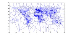
Plotting the locations of weather stations in the database shows that they are unevenly distributed:
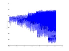
In fact, they are also unevenly distributed in time. Michael Scheiben has done a nice video of the data across time, showing how the stations come online - and go offline. For example, decolonization in the 1970s meant that Africa lost a lot of its weather monitoring. Just plotting individual station averages shows a broadening from Western Europe towards the arctics and tropics.
This of course means that just taking plain averages across the station data will not work, since there will be more tropical (and arctic) stations close to the present than at the start. And the stations are on different altitudes too.
Another obvious thing to plot is the monthly averages as a polar plot. I used different color for age, hoping to see clear trends:


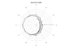
While this kind of plot makes it clear that winters have a greater variance than summers (at least in the northern temperate and artic zone) overall trends was relatively hard to make out.
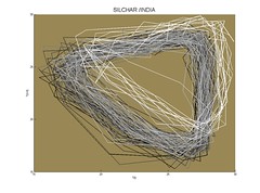
I hence turned to one of my old favorites, the time delay plot. Usually used to reconstruct strange attractors it just consists of plotting X(t) vs X(t+delta), where delta is a suitable delay. In this case 3 months is ideal. The result is a graph that shows more detail of the local temperature pattern:
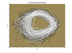
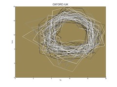
Stockholm and Oxford show the same kind of temperate, somewhat fuzzy dynamics. A bit more variance in winter, but not much.
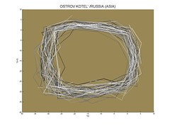
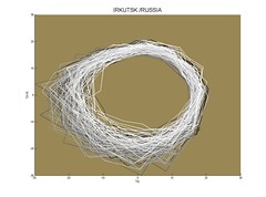
Siberia is much more angular or has high-variance winters. Central Antarctica is equally angular.
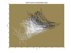
East India showed some noticeable trends, for reasons I do not yet understand (note that these two go in opposite directions). One reason why trends is more obvious here may be a smaller yearly variation in temperature, which otherwise hides trends in the above plots.
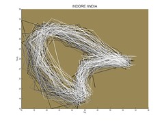
North India has a very characteristic shape that I think is due to the monsoon season. This is repeated across the monsoon area, and a somewhat similar pattern shows up in Mali - presumably the rainy seasons of Africa are a close dynamic counterpart.
Next step consists of merging data from the different stations to get estimates of how yearly temperatures change.
Posted by Anders3 at December 13, 2009 11:26 PM