September 13, 2007
Causes of Death
 A while ago I saw the diagram of National Geographic on causes of death as tbulated by NSC. While cool as data, as a visualisation it was pretty bad, as discussed here and here. Some people .
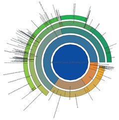
Here is my own take on it, based on hierarchical pie diagrams (pdf file) (I took the data from here, which incidentally shows how well information can be displayed just through a table). I have attempted to make it area-based: the annuli become thinner as they move outward to keep the total area constant.
This approach emphasizes the big areas we ought to worry about - traffic accidents, falls, assaults, accidental poisoning and suicide. Small risks like radiation are invisible. When talking about mortality people spend far too much time worrying about small exotic risks and far too little worrying about everyday risks.
I wonder about the possible serious underrepresentation of iatrogenic deaths here. Likely they are nearly all classified as due to disease when they ought to be in here. If added, they would make the last segment much larger than just 2,843 people.
Posted by Anders3 at September 13, 2007 10:43 PM