January 18, 2007
Melting the Clock
 Junk Charts criticizes the Doomsday Clock, both from a graphical perspective and conceptual perspective . Is it impossible to be more than 60 minutes away from disaster?
I'm perhaps even more annoyed by the inclusion of climate change into the calculation. Depicting a countdown to disaster makes sense when the disaster is something discrete. But what if we get tremendous climate change but no nuclear war? Should that be zero minutes, and if as insult to injury a war occurs, should the clock be at five past? What if climate change occurs, but it turns out to be not too bad?
The clock is a kind of symbol for existential risk, with 12 corresponding to a serious threat to human survival. But even with the most pessimistic interpretations of climate change it seems hard to get a result bad enough to threaten human survival. Drown Bangladesh, wreck harvests, freeze northern Europe and throw in a couple of unexpected hurricanes, and at the very most you get appaling death tolls and suffering locally, but in no way does it threaten the human species (se crude estimate below). The only way to seriously do that using climate change would be to argue for a total loss of planetary homeostasis producing a venusian hothouse (or a snowball earth), but given that Earth has survived periods of far higher CO2 concentrations that is pretty unlikely.
 Perhaps a better approach would be to use two hands on the clock, and one clock for each risk. The minute hand would represent probability (per year or decade or something suitable) of the risk occuring, the hour hand would show expected danger in terms of human fatalities (ranging from no to all).
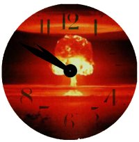
A thermonuclear exchange might have a probability of 1% per year and would kill about a 200 million people directly and indirectly (based on the estimates I came up with for a fictional setting based on The Effects of Nuclear War). So using a linear scale would put the hour hand at just around one a'clock and the minute hand at nearly one minute over. Not impressive. Lets use a logarithmic scale instead: each 5 minutes is one order of magnitude. So the minute hand will now be 10 minutes away, and the hour hand will point at slightly past ten.
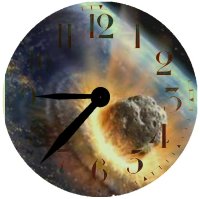 An impact of 2004/MN Apophis in 2036 has a 1/45,000 chance of occuring and could plausibly kill a few millions. That would put the minute hand at 23 minutes to 12, and the hour hand at about nine.
I have not seen any convincing climate change mortality calculations. This one argues for 7-19 million extra child mortalities in sub-saharan africa by 2050 and 12-33 by 2100 (in the mean scenarios), and 12-21 and 22-34 in Asia. This was calculated based on a model of GDP change due to climate change, and then a model forecasting poverty as a function of GDP and finally a model forecasting mortality as a function of poverty. While perhaps the best we can do given present data, I find the treatment highly uncertain. Given that global population curves have surprised people over the last 20 years and how complex economies are, I'm extremely doubtful of GDP predictions 40 years in advance - let alone how they are affected by climate (what will be the climate effects on nanotech businesses? genetically modified crops? hypereconomies?). I'm also pretty convinced that the model doesn't take technological change into account, and even a slight change in the mortality elasticity has enormous effects on the predictions.
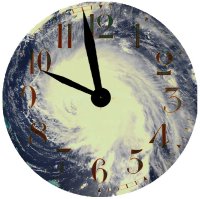 Anyway, let's say that the probabilty of climate change is about 0.5 - here the number might be more representative of how likely we find a particular risk scenario rather than that the climate is going to change. Assuming an excess mortality on the order of 50 million per year (here we should take into account a likely future human population of 8 billion). In that case we get a minute hand 1.5 minutes to 12 and an hour hand pointing at slightly before ten.
This last example probably demonstrates again the weakness of the clock metaphor when dealing with what is essentially a big family of scenarios - different mortalities, different population sizes, different chances of the outcome. Maybe one could make a clock with blurred hands representing the distribution? It is quite possible to put error bars onto the hands. The logarithmic scale also allows risks down to 10-12 to be shown as well as sub-person threats. Maybe this might be a useful complement to the colors I discussed in my warning sign post.
It looks like the logarithmic foreshortening may make the hour hand a bit too sensitive when it is in the area where these major disaster scenarios play out (much more people die in the nuclear war than in the climate disaster). The clock might be useful in that it provides a quick sense of whether a disaster is somewhere in the "global danger zone" of late evening, the national disasters of early evening, the local disasters of the late afternoon and the personal risks of early afternoon.
Posted by Anders3 at January 18, 2007 07:33 PM