July 23, 2008
The Graphs of War
Correlates of War attempts to collect data on international relations. During the recent conference on global catastrophic risks I started playing with their data on wars, coming up with the following graphs.
(Download PDF file with names)
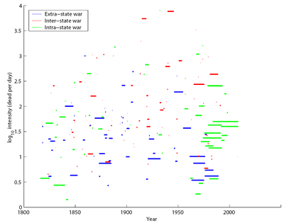
Here I have plotted each conflict as a bar, with length indicating when it occurred. Color denotes the type of conflict, with blue colonial wars, red nation-nation was and green ones as civil wars. On the vertical axis is the intensity, measured as dead per day.
The two world wars stand out at the top, with the equally intense (but rather forgotten) El Salvador 1932 war. There does not seem to be any strong correlation between intensity and time. The green wave to the right corresponds to various independence movements that started fighting in the 60's and 70's.
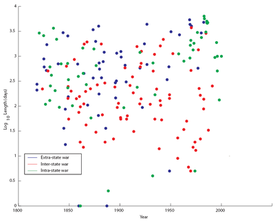
Have wars become longer or shorter? This plot shows the length depending on when the war occurred. It looks like wars 1900-1950 tended to be shorter than older and more recent ones. In particular some independence struggles drag on and on. Few wars are shorter than a month, but there are one-day wars.
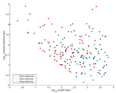
Plotting length versus intensity shows a cut-off in the data: conflicts below the lower left line are below the radar. There also seems to be a tendency for colonial and civil wars to drag on (presumably due to the use of guerrilla tactics) while inter-state wars are quicker and more intense.
From a global catastrophic risk perspective it is the big wars that are the main risk, from a personal life project perspective it is the nasty civil wars that tend to ruin people's lives and ability to flourish.