March 20, 2008
BA's New Map
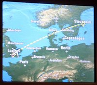 British Airways have introduced a new in-fight map. No more the over-saturated eyesore of the standard map, this one has mild greens, blues and tans that give it a nice modern appearance. The airplane icon seems to be antialiased, the resolution is high and some map views also show the day/night zones (using Nasa's famous world at night figure). A minor flaw: at the close zoom the 2D map actually looks like it has some jpeg-artifacts.
The amount of computer graphics involved is pretty impressive, Beside the 2D map it also displays a 3D view of the plane and its surroundings. The plane moves towards the destination along a strip of flying arrows, trailing a yellow ribbon. The view rotates, showing nearby towns an cities with billboarded names and arrows.
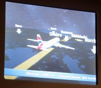
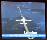
Occasional cockpit views and information boxes (beside the scroller with the usual wind, temperature, distance and time information) add to the infoglut. The cockpit views seem unrealistically high altitude, giving a feeling we are cruising at suborbital height. If only.
All in all, an improvement on a piece of information visualization that has always been more about entertainment and calming (yes, we are getting there) than high detail data.
Posted by Anders3 at March 20, 2008 07:10 PM