February 28, 2007
Silver for My Geometry
 (links only in Swedish for this entry)
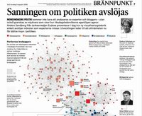
I have just touched the lower slopes of the information graphics Mount Parnassus (where, I assume, Edward Tufte sits at the top throwing sparklines at bad designers and wasters of data ink). Svenska Dagbladet got a silver in the category informative graphics in the Society for Newspaper Design competition for a debate article I had made the basic content. Of course the real praise and congratulations should go to Anders Mildner, Joakim Larsson and Susen Schultz who did the real work on the article.
I remember standing in a doorway on Hythe street to avoid the pouring rain debating with them over the cellphone about what interpretation one could give to the principal component axes in my diagram. In the end they wisely dropped that figure, and that was probably what led to victory. Less is more, especially when it comes to confusing diagrams. They also did the important work of adding explanatory details, the photos and turning my rather messy left-right scale in a clearer diagram, among other things.
Anders Mildner blogs about the background of the article here.
In my case it started when I had to make exercises for a neural network course many years back and I let my students classify various datasets using neural network methods. One set was US congress voting records, and a bright student wondered if he could use Swedish voting records instead. He did, and I used some of the Rixlex data in subsequent courses. Another bright student (Axel Liljenkrantz) discovered that it seemed to be very low-dimensional (he needed just two hidden neurons in a backprop net to categorize it) and that got me interested in making visualizations. I did a principal component analysis and various spring models, some of which ended up as a VR simulation people could enter into using the KTH CAVE. Unfortunately our seminar when we presented it was just the day after a political scandal, so we only got one visitor, and he was mostly wondering if this was what his tax money was used for.
Over the years I developed other political visualisations, putting some of them online. Eventually I managed to put it all together into my report, which became the basis for the article. I hope to make this kind of report a yearly occurence, measuring how the political network changes over time. But as my experience with SvD shows, it takes more than good software and math to make an accessible report.
Posted by Anders3 at February 28, 2007 12:38 PM