January 31, 2007
Going Global
 I remember seeing a display of population growth at the Monterey Bay Aquarium some years ago. It showed population by adding million person dots to a map as a time counter passed. Intended to have an environmental message it probably sent a chill up the spine of many visitors as they saw the explosion of humans. To me it sent another signal: the sheer beauty and wonder of how our species has managed to colonize this planet thanks to our (admittedly limited) intelligence. Each dot was a million more minds, able to achieve anything.
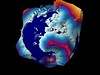 The G-Econ project has done some great work on geophysically based data set on economic activity for the world. Their globe visualisation of economic activity filled me with similar awe as the Monterey display, and I immediately decided to try to render my own using their data.
My approach was to read the data into Matlab and use it to produce an include file for the PovRay ray tracer. This way I could both change scaling and color scale, as well as get shadow effects and transparent seas.


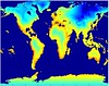
Another fun use of the data is to try to figure out the nicest place to live. I like temperate climates, low levels of precipitation, closeness to the sea and a strong local economy. So I made up a quality measure based on the sum of these factors and plotted it. The result was the suggestion that I should move to Tokyo. Other plausible places were California, Chile, south Australia, Osaka and Paris. Namibia might be a less reasonable suggestion.
I love global statistics.
Posted by Anders3 at January 31, 2007 04:33 AM