December 07, 2006
Rank Appeal
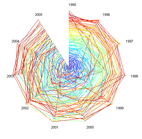
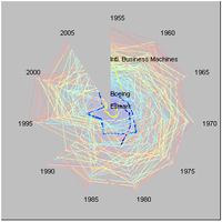 Rank clocks were introduced recently in Michael Batty, Rank clocks Nature 444, 592-596 (30 November 2006). Essentially they are a polar plot of the rank distribution of data over time, enabling the viewer to see how it has changed.
The point of the paper is to show that despite the prevalence of beautiful power laws that stay invariant over time there is actually a lot going on. There is quite a bit of movement going on, and staying in the top positions may be a very temporary thing. Individuals rise and fall, and this is incompatible with the quite common assumption these power laws are due to a 'the rich get richer' process. Batty demonstrates this with the example of city sizes in the US, UK and the world.
So far so good. It is just that I'm annoyed by the rank clock! This seems to be a graphical gimmick rather than a good visualization. First, there is no obvious benefit from a polar plot compared to a rectangular plot - sure, naive readers might more easily understand a clock than a straight diagram, but if they have that problem they will have a hard time understanding rank too. And the polar plot makes it much harder to see if something is rising or falling in ranks - in both cases you get spirals, but the derivative is now represented more by the direction of curvature than the actual direction! Placing the first ranked at the center serves to deemphasize them and their changes while emphasizes what happens at the rim. The usage of bright saturated colors is of course endemic to all science, but using heavily overlapping lines really doesn't help either.
The Fortunes of the 500
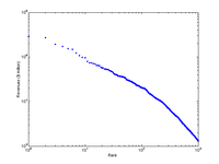
Anyway, I couldn't resist playing around with rank data myself. So I took the Fortune 500 companies as raw material. Looking at the assets as a function of rank produces a very nice power law (or perhaps better, two power laws).
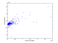
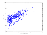
Incidentally, plotting assets vs profits showed that there is a general correlation between size and profit and that the biggest ones seldom show losses.
Plotting the 100 biggest companies for the period 1955-2005 (five year steps) and 1995-2005 (one year steps) produce the following rank clocks (color depends on the rank a company first appeared at):
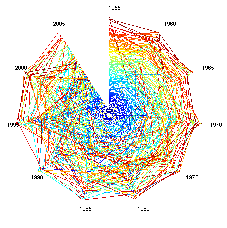
The important thing is that the volatility is lowest among the biggest ones. Is this clear in the picture? Now compare this with a simple rectangular plot:
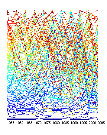
Suddenly it is much easier to see, despite the color scheme. Muting the color scheme and thickening lines to bring out a few interesting companies is even better:
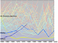
If there is one thing to learn from this dataset it is that even in a situation where "the rich get richer" is a plausible dynamics it is still turbulent around the top of the power law. The truly big are relatively slow changing, but sometimes new giants just jump in - Wal-Mart has been on the list only since 94. Of the 10 biggest in 1955 only four are left today.
Of course it is conceptually wrong to put the biggest companies at the bottom like I have done here. Biggest should be on top.
I based the color ordering on at what rank a company appears for the first time. This has a nice side effect in that it allows to see the mixing going on: a red company in the top arrived small and grew, while a blue company in the messy lower rankings has fallen from an initial position. But likely the color scheme should be calmer and more 1D.
The Matlab code I used to make the plots can be found here: Download file
Posted by Anders3 at December 7, 2006 03:00 PM