May 31, 2006
Earth Day Ducks
 Information Aesthetics points to some Earth Day infographics in Seed Magazine on the state of the world. I like Seed in general, but here it has been seduced by the green side of the force into misleading.
Despite a lot of design style and fun ideas, it isn't very good data display. I have no doubt Edward Tufte already has blogged about it, but the data ink vs ink ratio isn't very high. We do not need drop shadows to understand, usually.
[Actually, drop shadows do help understanding one thing: the height of something above a surface. We get that information very intuitively, so if an icon is floating and the floating distance tells us something, the shadow has merit. ]
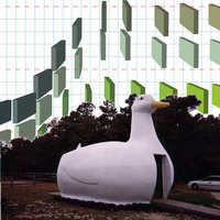
The Hurricane data almost looks like a duck from one of Tufte's books. It makes it hard to see the important ratio or compare regions by not aligning, suggests a perspective that actually lessens the difference between the two overdecorated bar graphs and in lieu of good design just tells the favored conclusion in the title without allowing the viewer to actually check it. Another offender against comparision is the lego block like graph of pollution where it is impossible to actually see the change between different pollutants - a simple bar graph would have done the job instantly. And the uncertainty over whether it is linear dimension, area or volume that represents magnitude recurs again and again. The water availability graph confuses both by this uncertaintly and by not having an obviously undrinkable waterdrop (say dirt brown rather than pale chickenpox - when did you last see that kind of water? Maybe it is actually polka-mint tasting water?).
Several graphs are downright misleading. The "Grass is Greener" uses a pie diagram area to depict urban vs rural population. The immediate impression from the image and the text is that the US is 79% covered by city. The graph really shows that a lot more people live in urban areas now, not their environmental impact.
Also, taking environmental data straight from Greenpeace ought to be as obviously stupid as getting it from Exxon. Even with the best data available these graphs would tend to mislead or confuse but if the data can also be suspected of being biased, there is precious little left to believe here.
Many of the graphs are based on long extrapolations, often apparently used more for impact than real information. The worst offender is the 3d bar dagram at the bottom of "Heat the Poor", which shows a steady increase of sea levels - but the last two bars represent a level of ????? being reached in ????? (!). Even doing a linear extrapolation would have been more informative. Here the designer got away with using made up data that cannot even be criticised, since someday it might become true.
The meaning of the extrapolations are also biased. Bad, Worse, Worst uses its title to make sure that it is interpreted in the worst possible way. But a rise in CO2 is just that, it is its consequences are what really counts.
Shouting harder is not a good kind of argument. Two graphs use the "huge fontsize number" to tell us about extinction rate and water usage. Important numbers, but just put there without context and intended to raise emotions but not inform. I'm reminded of the acceptance letter Tufte blogged about which actually got this trick right - it gave salient information and even an emotional boost - but these doesn't tell us much relevant. Especially the extinction risk number is just scare, since it is the number of species that might go extinct, but to see the underlying assumptions, distribution and other information making the number relevant you have to go to the original article.
I don't know if the cause of this is an earnest desire to help planet Earth by any means (including misleading and exaggerating) or just a designer with more concern for cool graphics than the importance of what he is trying to show. My guess is the latter, since many of the errors actually weakens the case. I guess it is better holiday imagery than pumpkins or santas, but it does not actually manage to inform.
Posted by Anders3 at May 31, 2006 07:31 PM