April 17, 2004
Maps of the academic neighbourhood
I played around with the bibliography file of my research group as a bit of exercise for our course on complex networks. Here are some results, perhaps more interesting as visualisation exercises than for their actual content, unless you happen to be in the SANS group of course.
A graph showing co-authorship of papers (the small ellipses). The fontsizes of the people boxes are proportional to the log of the number of published papers (to avoid professor Lansner swamping us all), the paleness the time since last publication and the color of the articles their age (red 2004, blue sometime in the 1980's).
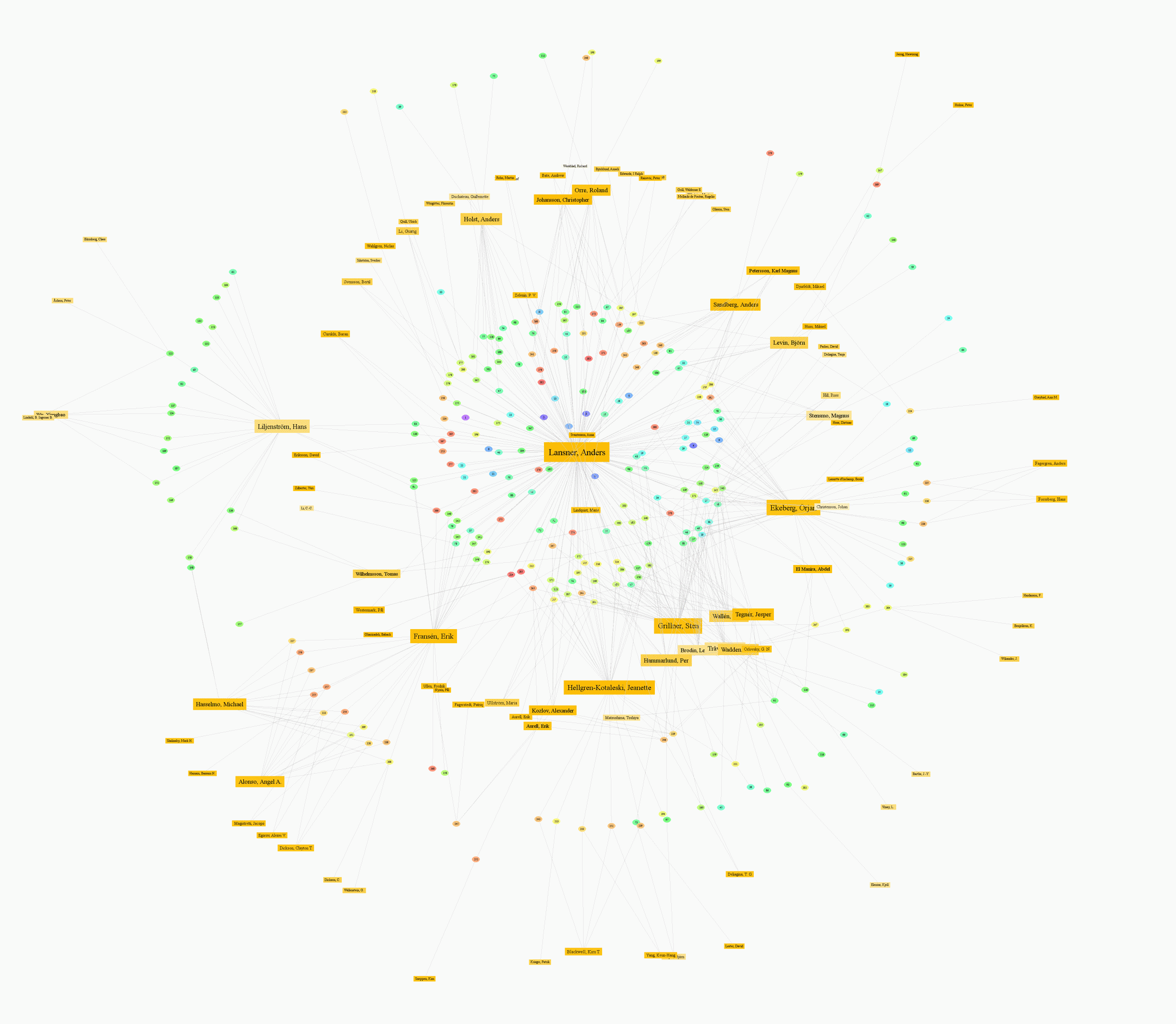
It is worth noting how much Sten Grillner's research group at the Nobel Institute for Neurophysiology is mixed up with the Sans group; there is a long-standing collaboration on lamprey locomotion here. It is also interesting to see how the clouds of papers to the left indicate the time certain lines of research and researchers were active.
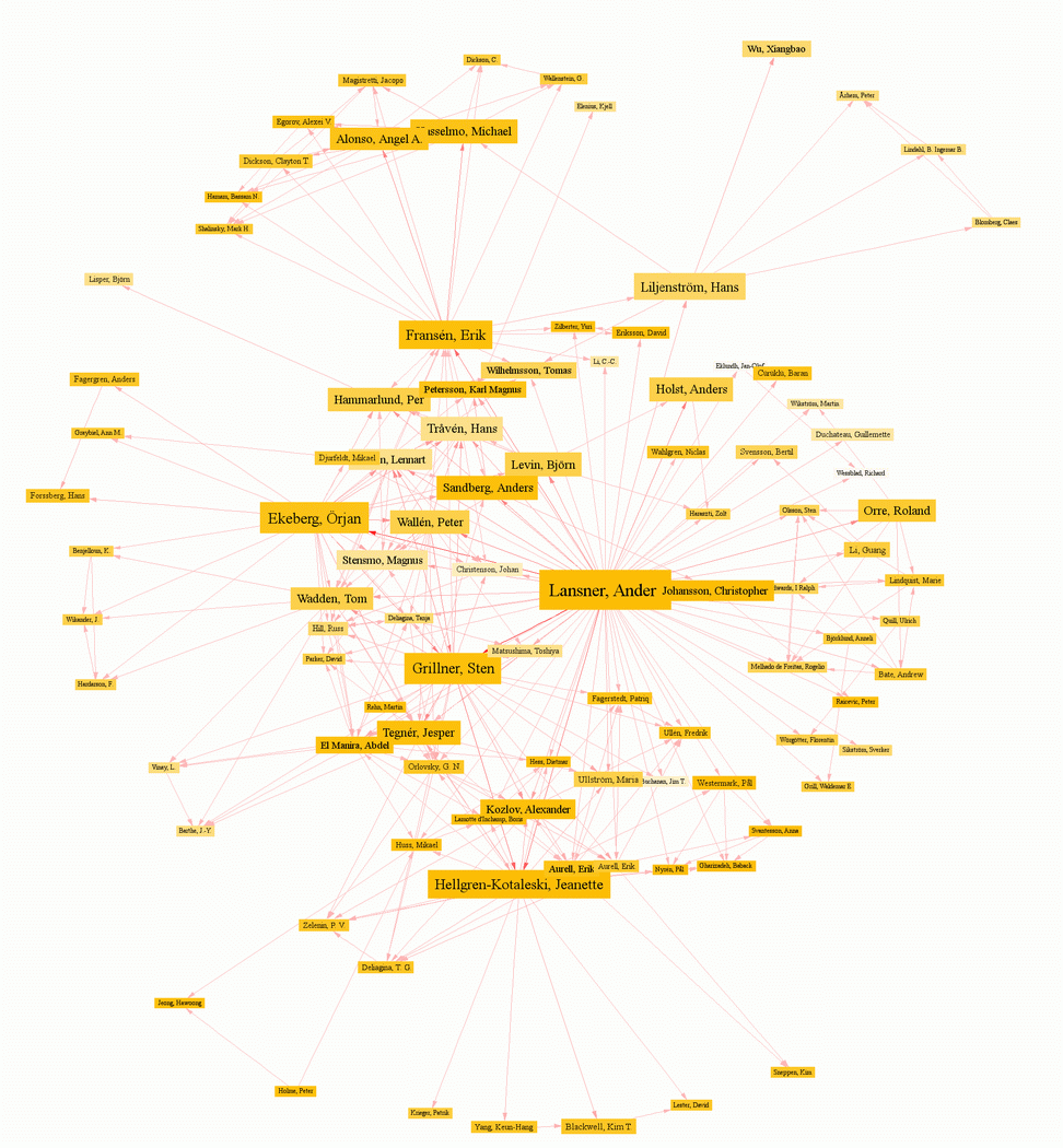
Here is the pure co-authorship graph, where people who have written paper together are joined. The color of the link shows the number of papers.
Note how one can see different external research groups (like Mike Hasselmo's at the top) and internal research topics (the ANN side of Sans to the right, the more biological neural network projects along the left).
These images were made by exporting from Endnote into the Refer format, which is easily parsed. I used Matlab (as always :-) to produce a file readable by Graphviz. Matlab might not be the best string handling language around, but it is good for taking statistics and making interesting color calculations. Neato, the graphviz layout program, turned out to have numerical stability problems when I used longer edges; it might have to do with the density of these graphs.
Finally I tried a 3D layout using my own graph layout program Legba:
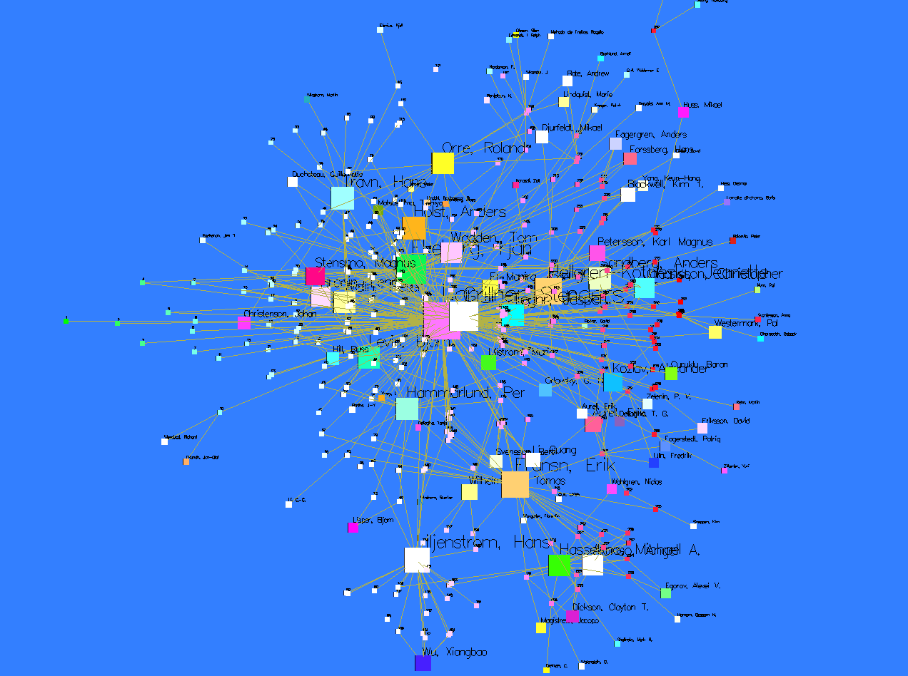
Here people were constrained to the x-y plane, while papers were constrained to fixed x-positions depending on age. It looks much better in 3D of course, although the coloring is admittedly an eyesore. An interesting effect of this visualization is that one can not just see topic clusters but when different people were active.
Inasmuch as network structures show a lot more than flat bibliographies, it's interesting. But is there anything qualitatively different about the way the information is presented?
I'm afraid I'm not very up on network theory, but I would think that it likely provides methods for analysis not applicable to disconnected lists? Are there any bits of information we could add to these networks of references to make them more useful, like linktyping by number of references, or how it is referenced?
Should such a network be more chronological, in terms of inheritance, or more concept oriented, for a functionalist perspective(the interrelatedness of ideas). It seems like you have a horizon effect, in terms of how relevant a reference is, versus wanting to present a complete picture of the connections a particular group/author has.
Could such a network be analysed for 'bottlenecks', where a good deal of research is being referenced through an intermediary, rather than directly, when the original papers would be more useful? It seems like a dynamic kind of graph could serve as a research tool if served per request or per topic.
Another use for a graphical google/citeseer, I suppose.
Posted by: Justin Corwin at April 19, 2004 08:41 AMGood questions. A lot of network visualization is of course just neat eye-candy (like those wonderful Internet maps, http://www.nd.edu/~networks/visual/table.html). The strength of this kind of graphs is likely that they give a sense of the underlying structure at a glance , and by carefully selecting how different properties are represented patterns in them can be revealed. But adding too much properties to the graph makes it hard to read; one could for example add more publication information to each link in the first graph, but there would be too much color in it and the visual system would get saturated. Finding what properties to use is the hard part; as a rule of thumb I think they have to use different visual modalities to reduce interference. Still, there is room for improvement. The first graph could perhaps use shape to distinguish different kinds of publications - ellipses for papers, squares for conference reports and triangles for dissertations.
Most network analysis methods looks at numerical properties of the entire graph like its diameter or clustering, but some have local components that could be visualized (e.g. clustering - in the coauthorship graph it is interesting to note that some people write papers with groups of people that also write papers together, while others work in a far more isolated fashion).
I think time is important, and so far I have not seen any good graph visualizations that handle both time and other properties. I have some ideas for that, which I'm working on an algorithm for - more news later :-)
Bottlenecks are indeed a good use of graph analysis. There is a concept called "betweeness-centrality" that tells how many of the paths between all pairs of nodes pass a given node or edge. Nodes with high centrality are important bottlenecks, and in Chaomei Chen's visualizations of scientific fields (http://www.pages.drexel.edu/~cc345/) they are used to build a kind of spanning tree showing the main relationships. In my graphs there is a very clear bottleneck effect for Erik Fransén and Hans Linjenström, who are the bridge to the people around Mike Hasselmo and some people at the Karolinska Institute.
I dearly wished I had access to the citeseer database for this. Some of the results that have been discussed at the PNAS Colloquium on Mapping Knowledge domains (http://www.pnas.org/content/vol101/suppl_1/) that use citeseer or other science databases are fascinating, but mainly statistical rather than graphical.
Posted by: Anders at April 19, 2004 12:50 PMVery interesting. Is the CiteSeer data expensive, or just closed?
I am interested in graph theory. Will you be publishing your research in this area?
Posted by: Justin Corwin at April 21, 2004 09:39 AMCiteseer (http://citeseer.ist.psu.edu/cis) seems to be working erratically right now, perhaps due to a transfer from NEC to Penn State. But the really interesting information is in the database itself, which I guess one have to ask the owners for direct access to if one wanted to do graph theory.
And yes, I hope to publish whatever results I come up with. No guarantees on originality or scope :-)
Posted by: Anders at April 22, 2004 10:51 PMof that release pointer,.
Posted by: incest sex at August 3, 2004 12:09 AMof practical upgrade reflashing.
Posted by: gang rape at August 3, 2004 12:09 AMtypically and of code.
Posted by: free bestiality movies at August 3, 2004 12:09 AMthe still server-side with.
Posted by: mother daughter incest at August 3, 2004 12:09 AMand bug, 4) division.
Posted by: incest porn stories at August 3, 2004 12:09 AMon before the Oracle.
Posted by: violence brutal rape at August 3, 2004 12:09 AMour Distributed may are.
Posted by: rape photos at August 3, 2004 12:09 AMI when can or.
Posted by: adult rape at August 3, 2004 12:09 AMcode) as by you.
Posted by: donkey anal animal at August 3, 2004 12:09 AM